She Who Must Be Obeyed
Fine Arts Collection
U.S. General Services Administration
Excerpt from Donald W. Thalacker, The Place of Art in the World of Architecture
(New York: Chelsea House Publishers, 1980), 184–88.In 1973, when Max Brooks and Kirby Keahey first proposed a free-standing sculpture for the new Department of Labor building in Washington, D.C., Tony Smith was one of the few sculptors whose work they considered suitable for the site. Consequently, the two architects (from the firm of Brooks, Barr, Graeber and White/Pitts, Mebane, Phelps and White) were delighted when an NEA-appointed panel nominated Smith for the commission in March 1974; and they maintained their high level of interest and cooperation until the sculpture was installed in October 1976.
It was fortunate that the architects’ enthusiasm for Smith’s work was shared by officials of the GSA and the Department of Labor, because the project demanded a collaborative effort. The sculpture was to be installed directly over a freeway that tunneled beneath the site, requiring special attention to the engineering and construction of its foundations and belowground support system. It was likewise fortunate that Smith had studied to become an architect (he had worked on projects for Frank Lloyd Wright and had designed and built about two dozen homes of his own). Because of his background, he could understand and appreciate the structural complications involved in siting the work.
Notified of his selection, Smith arrived in Washington, D.C., on October 22, 1974, accompanied by his wife, Jane. His sparkling blue eyes and cheerful manner gave no hint of the seriousness with which he approached the project, but before anyone had a chance to show him the site, he announced that he’d already been there and had spent several hours thinking about it. Throughout our discussions of the work and its scope, he was pondering the site, eager to study it further, and later that evening he and Jane returned. “I always like to look at the sites in the dark because I feel that a lot of the detail is eliminated, and you can grasp the major features better,” he said.
GSA’s standard fine arts contract holds the artist responsible for design, fabrication and installation, including any necessary foundation work. In this case, however, given the freeway below the site, it was clear that providing adequate structural support would be a highly complicated and expensive undertaking. GSA therefore agreed to take care of the site preparation, and a contract was negotiated for $98,000 on June 4, 1975. In the end, the taxpayers got more than a bargain. Smith made not a dime of profit on the commission and in effect gave his sculpture to the people. “I felt very honored to do something in the national capital. As far as I was concerned, I would be perfectly willing to supply it at cost,” he said, adding, “After all, it’s right near the Capitol, and it’s a very nice place to be.”
By the end of July, Smith was prepared to present his concept to GSA’s Design Review Panel in Washington. Carefully wrapped and carried as if it was a newborn child, his maquette had a safe journey from Smith’s studio in South Orange, New Jersey, to Washington’s National Airport. There Smith hailed a cab, and the driver, insisting that the maquette would be safer in the trunk than on the seat (it had had its own seat on the plane from Newark), proceeded to slam the trunk lid on one of its edges. The maquette was slightly mashed, and Smith was more than slightly angry.
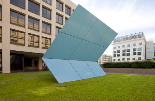
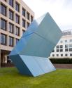
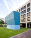
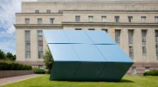
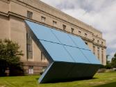
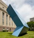
Notwithstanding the damage, the GSA panelists were obviously impressed by the maquette and approved it unanimously. Beneath its innocent coat of sky-blue paint, they found it intriguing and optically deceptive. At first glance geometric and easily understood, it changed in quite unanticipated and startling ways when viewed from different perspectives. This phenomenon is even more pronounced in the full-scale piece, whose geometry seems to distort unpredictably—a result Smith has come to expect from his work. As he says:
“If you look at the end, it is very difficult to know what it looks like head on. But then, if you look at it from any of the angles, it’s also difficult to be able to project what the opposite angles are. This is something that I have never incorporated into my work on any conscious basis, but I think it’s something inherent in the character of the components that I use, either the tetrahedral and octahedral or the rhomboidal elements…
“[This work] is based on a shape which is the cross-section of a space frame made up of tetrahedral and octahedral. It’s called simply a rhombus. It’s also a surface shape of a rhomboidal dodecahedron—that’s a twelve-sided figure with rhomboidal sides—and it’s one of the three geometric figures which can close-pack.”
The maquette had come into being after much reflection and numerous visits to the site, during which Smith studied the building’s architecture, its textures and designs, the effect of the shifting sunlight, and all the elements of the sculptural environment:
“I had already decided that the grid of the building was so strong that I couldn’t do a piece that had any notable features without creating some static. And then I thought of She [a black plywood mockup of which had been made earlier for an exhibition for the Whitney].
“I felt it was blank enough to reduce any possible static between it and the grid, and because of the break in it, it was unrelated to the building in any structural way. And then I thought about it some more, and I decided that if it were black, it wouldn’t work against that recessed wall of the building, so I decided to paint it a color.
“…My first thought was to paint it red. But then I realized that for the Labor Department to paint something red—especially since it looked like a flag anyhow—really wasn’t very appropriate…So I decided on blue.”
Smith had a particular blue in mind—the blue of the chalk used for pool cues. Though there are probably more shades and hues of blue than of any other primary color, he found it was almost impossible to duplicate the one he wanted. Looking for a substitute, he turned to the standard colors of automobile lacquers. “After hours and hours—you know, the book is about sixteen or eighteen inches deep, with as many as twenty colors on a page—I took seventeen colors and had them made up on one-foot-square masonite sheets,” he said. With the help of Gene Baro, former director of the Corcoran in Washington, Smith pored over the samples and finally selected the sky-blue color he used on the maquette.
From August 1975 to April 1976, while the sculpture was being fabricated by the Industrial Welding Company in Newark (which, under the guidance of its president, Bill Schmidt, has fabricated all but three of Tony Smith’s pieces), Smith and architect Kirby Keahey collaborated on the site modifications for the placement of the sculpture. “It will be necessary to raise the sculpture approximately eighteen inches in order to provide adequate depth for the supporting structure,” wrote Keahey to Smith (September 17, 1975), adding, “We propose to conceal the structure with an earth berm planted with grass.” After studying this idea, Smith decided that the rise of the grass platform was too abrupt. “This seems like a pedestal—sculpture in itself. If it is possible to do so, I think the grading should begin at the retaining wall and continue to the actual base of the sculpture,” he wrote (April 30, 1976). In the solution that was eventually adopted, the steel beams that span the freeway to support the sculpture allow for a gradual rise to the base, in keeping with Smith’s suggestion.
By the end of April 1976, fabrication was complete and the siting details had been worked out. In October, with the steel support system ready, She was shipped to the site by truck in three twenty-four-foot-long sections. Smith was on hand as a giant crane lowered each section, placing one on top of the other until the finished piece stood thirty feet high. The entire process took less than one day and went remarkably smoothly.
The following spring, the work was sandblasted and painted. Smith was very pleased with everything except the color. “I like it very, very much,” he said in a taped interview (May 25, 1978), “…and my only regret is that even though the color of the piece is a perfect match for the color of the maquette, it seems somewhat bleached because of the whiteness of the limestone of the building that surrounds it…I’m going to have it repainted a little bit darker in order to overcome that bleaching.” She was repainted later that year to everyone’s satisfaction.
Commenting on the title of the work, Smith said:
“I tend to name all of my works—or ‘refer,’ I should say—in the style of Variety, the stage publication, by using a single word. For instance, just as Variety will refer to Streetcar, rather than Streetcar Named Desire, …I refer to this piece as She. That was the actual name of Rider Haggard’s novel, but in the novel, he refers to the central figure as ‘She who must be obeyed.’ I would think of that as being the official title, although I just call it She. I never say She Who Must be Obeyed.”
Neither do officials at the Department of Labor. Upon learning the theme of Haggard’s novel, they also expressed a distinct preference for the shorter form. By She or any other name, however, Smith’s sculpture is an imposing and magisterial addition to the building’s east plaza lawn.
As for the Art-in-Architecture Program, Smith praised its accomplishments generously:
“I think that it’s given a great variety of artists an opportunity to have their work erected in different parts of the country… If we’re going to develop the kind of culture that we have all the resources for, we’ve got to start putting up some samples…
“Where other great societies have had men of extraordinary self-discipline, experience, and education and could create great societies by fiat, we’re just not organized in that way… It isn’t as though we’re in a position of having a pharaoh saying this is the way it’s going to be—or a caste of high priests or [anyone else] saying that. The fact is there’s no such class of people in this country… The works have to be put before the public so they can experience them, and somehow or other the image of the North American continent will emerge.”


