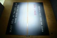
Don't Nod
Fine Arts Collection
U.S. General Services Administration
Edward Ruscha’s work explores the American commonplace: parking lots, city streets, movie screens, road signs, and—especially—words. As a teenager, Ruscha drove out Route 66 from his home in Oklahoma City to a new life in Los Angeles. This journey along America’s iconic highway profoundly influenced Ruscha’s future work, which exemplifies a unique aesthetic informed by his training as a commercial artist and his interest in the fragmented visual experience of automobile travel. In his early paintings, Ruscha juxtaposed comic-book covers, logos, and bold words—sometimes representing sounds, such as “OOF” and “HONK”— recombined into new and often humorous tableaux. Likewise, his landmark 1963 book Twentysix Gasoline Stations offers deadpan frontal images of route 66’s architectural standbys, inviting readers to contemplate these utilitarian constructions. We rarely stop to consider the ceaseless barrage of words, images, and ordinary objects encountered in our daily lives, but Ruscha’s paintings, drawings, photographs, and prints defamiliarize them, prompting viewers to reassess their forms and meanings.
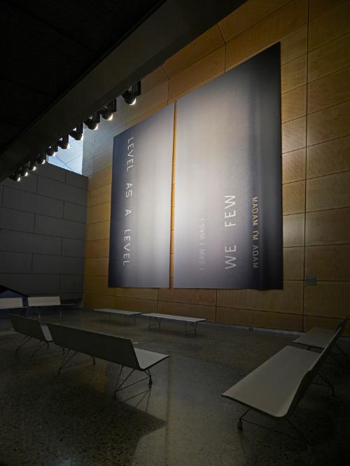
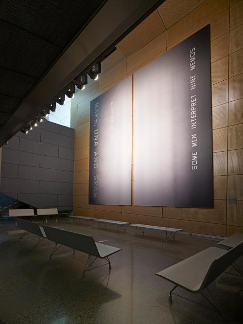
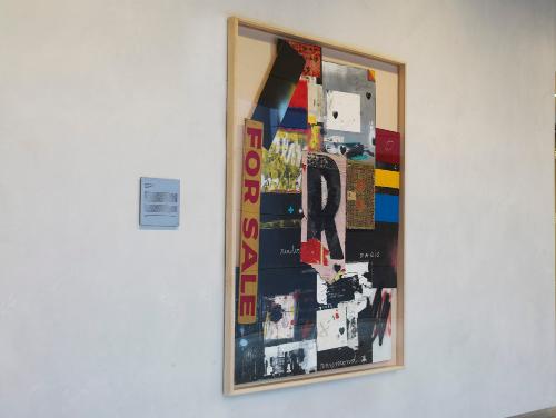
Such is the case with Ruscha’s LEVEL AS A LEVEL; DON’T NOD; I DID DID I; and MAPS, DNA, AND SPAM—four related artworks, one located in each of the skip-stop elevator lobbies of the San Francisco Federal Building. The images feature palindromes—phrases that read the same forward and backward. Their verticality relates to the movement of the elevator cabs. Ruscha notes: “The idea of letting these statements run up and down on their sides seemed to support the notion of an elevator experience. The four images begin to ‘talk’ to one another.” While the scale and finish of the work recalls billboards, the upright orientation of the palindromes makes their forms less familiar, delaying the instant recognition that words usually trigger. Likewise, the enigmatic phrases, which hover on ghostly backgrounds like signs over a foggy San Francisco, elude easy interpretation. Thus, Ruscha gives pause to the habit of reading, making the words in these images appear fresh again.


